Open Lab
Open Lab is a makerspace at the University of Pittsburgh that supports more than 3,000 members across students, faculty, and staff. I led an end-to-end redesign for its main website to simplify how users find and access its services.
Duration: April - August 2025
Responsibilities: UI/UX Design, User Interviews, Information Architecture, Responsive Design
Tools: Figma, Miro, WordPress
PROBLEM
New site visitors couldn't locate essential information
Members frequently asked staff for help finding training materials, hours, and booking links. Confusing navigation buried key actions, causing staff to handle questions the site should have answered.
The lengthy onboarding survey to begin booking.
How might we…
Structure navigation and information hierarchy to support fast, low-effort decision-making?
Evolve the visual experience while working within existing brand guidelines and platform constraints?
SOLUTION
Intuitive pathways for different user needs
By streamlining the landing page into one primary action per section, I was able to elevate the experience while also providing more clarity and ease of use to new visitors.
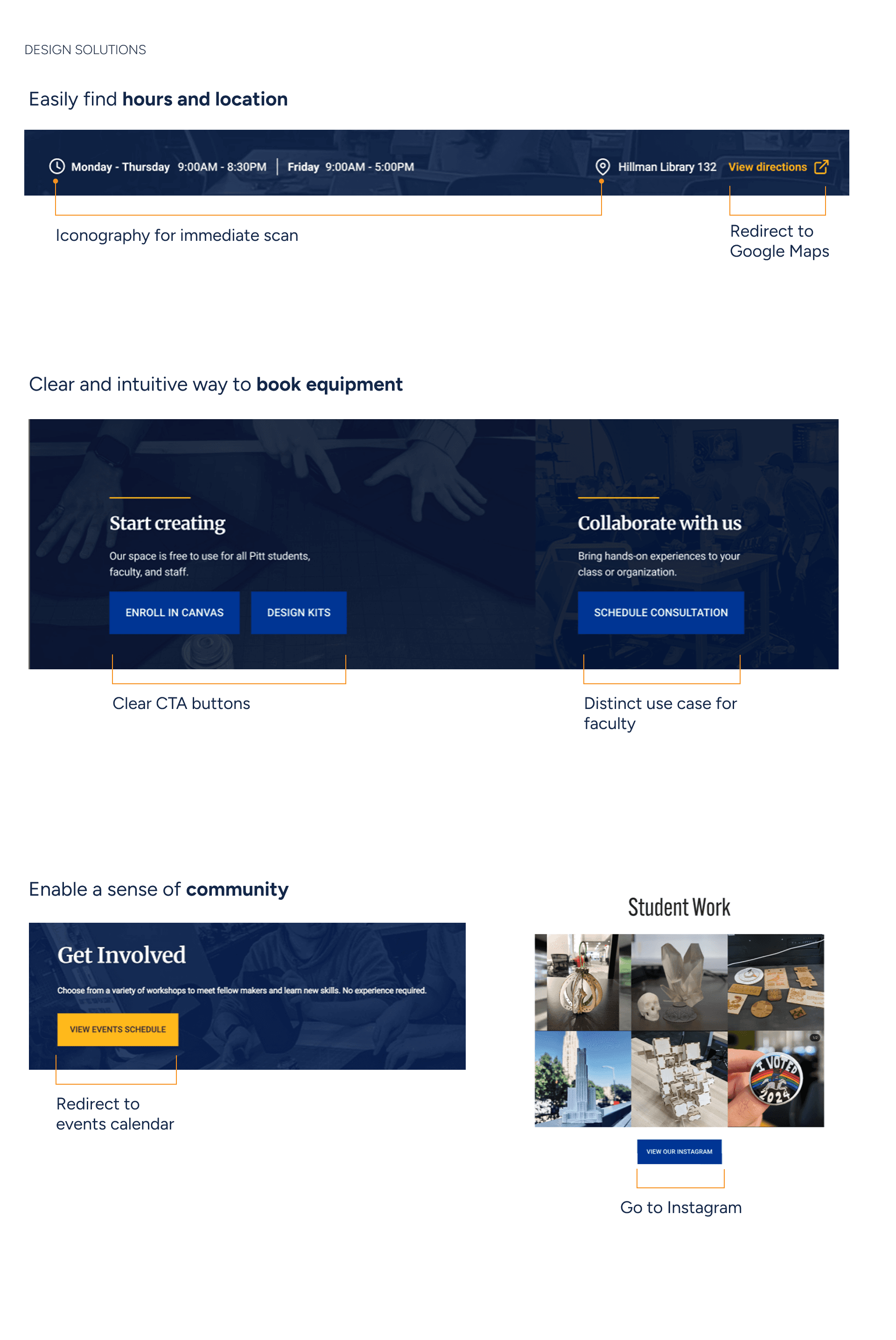
Direct links to booking
Clear primary and secondary actions allows users to quickly scan for the most frequent action
Clear hours and location
By placing icons at the top of the page, new visitors can quickly orient themselves and plan when to visit the space
Tie-in to community and social media
Images of members' work and redirects to social media provides a clear call to action
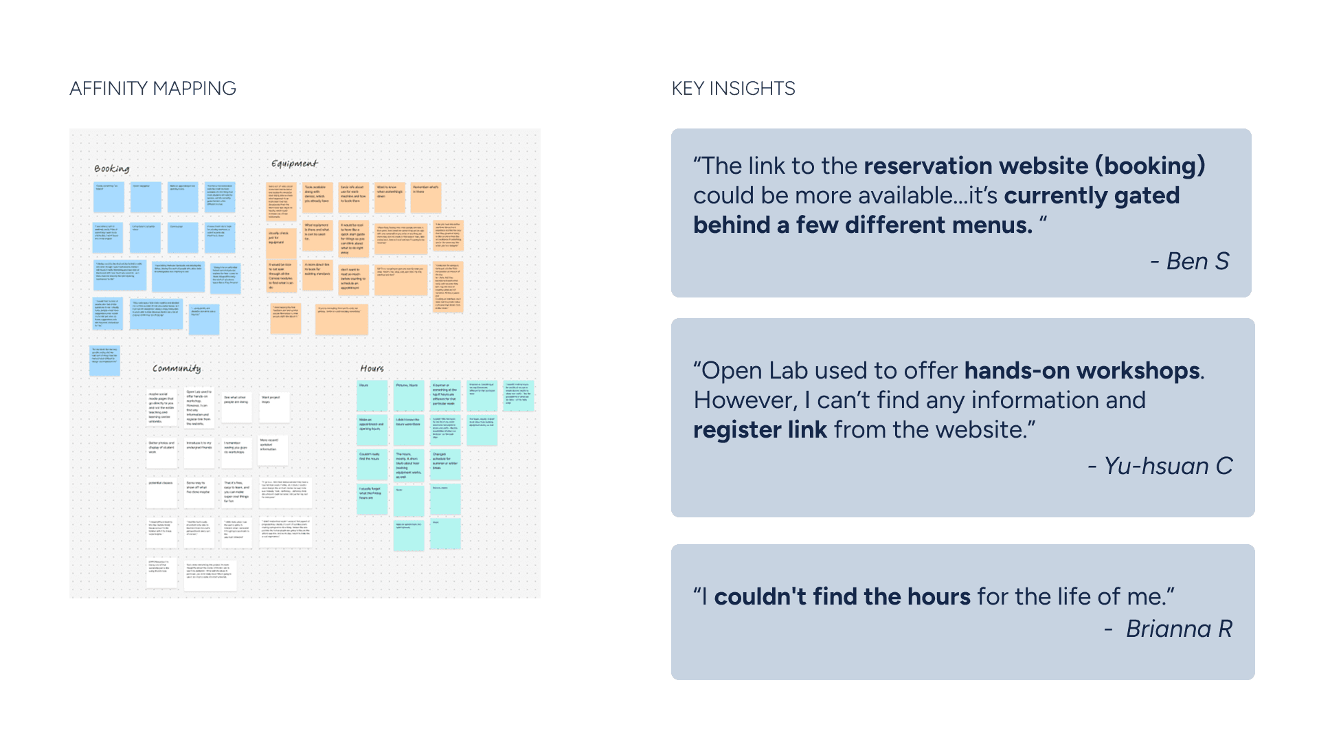
RESEARCH
Using data to drive desicions
To understand which problems the redesign should prioritize, I spoke on-site with members and staff, recruiting frequent users through the organization’s Airtable database.
13
interviews with members
4
subject matter experts for feedback
5
users for task testing
The common theme in pain points was findability and navigation
Users consistently struggled to locate basic operational information such as booking links, workshop details, and hours. The issue was not missing content, but poor visibility of essential actions across the site.
Mapping out the user journey showed an opportunity space
By mapping out the journey based on member and staff experiences, I noticed that users experienced the most friction during research and preparation, when they were asked to understand processes and requirements before taking action. Without a clear starting point, users often turned to staff for help navigating next steps.

Translating journey insights into a clearer site structure
Building on user journey insights, I restructured the site architecture to align content with primary user goals. Redundant paths were removed, core actions were consolidated, and navigation was simplified to reduce cognitive load and improve discoverability. This clarified structure set a strong foundation for the wireframes that followed.
Students need to find and book equipment easily to complete academic or personal projects.
Faculty want to integrate maker tools into courses, but need to know what’s available and how to start.
Staff needs to coordinate training and workshops, using the site to share updates and resources.
WIREFRAMING
Wireframing mobile designs to explore content hierarchy
Building on the restructured information architecture, I started with mobile wireframes to translate the new hierarchy into clear, task focused layouts.

This helped validate content priorities early and enabled rapid iteration before moving into visual design.
Scrapped concepts

VISUAL DESIGN
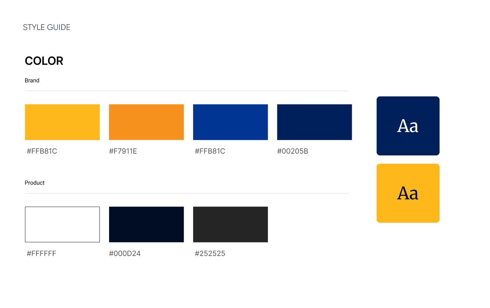
Styles based on brand guidelines
Visual decisions were guided by existing brand standards to ensure consistency across Open Lab touchpoints. Typography, color, and contrast were applied deliberately to refresh the interface while maintaining familiarity and meeting accessibility requirements.


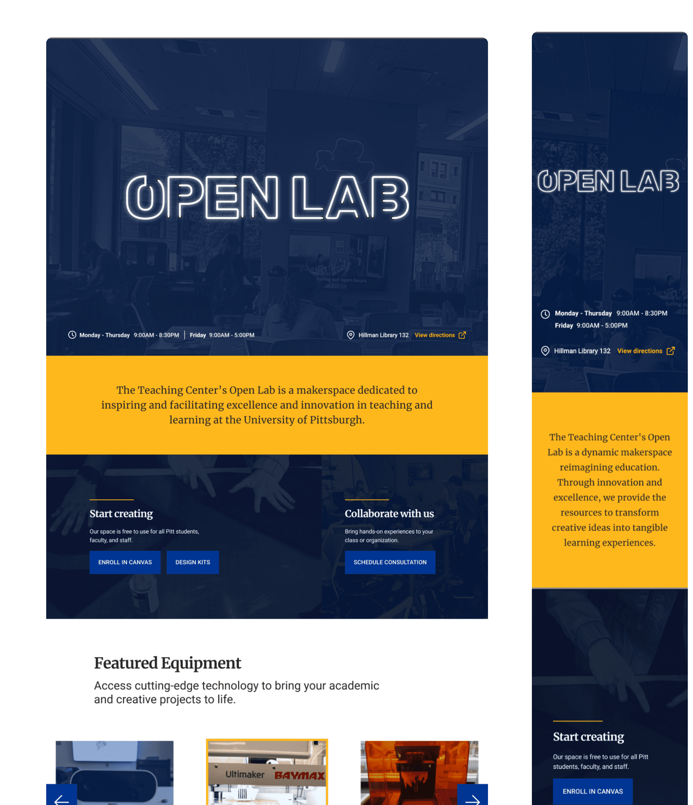
Final high fidelity design for web and mobile
Implemented in WordPress staging site
I implemented the redesigned pages in WordPress to test layout translation and responsiveness. Using a staging site helped refine interactions, fix alignment issues, and confirm that the design performed as intended across devices.
Responsive design
Implemented breakpoints for cross-platform consistency
Custom code
Wrote CSS and JS to better fine-tune behavior and overcome WordPress limitations
IMPACT
37%
increase in user satisfaction scores
57%
faster avg time to access booking

"Are you interested in more work? The OL site was a big hit and there's now a lot of folks talking about how they want to reconceptualize their teaching center sites."
AARON GRAHAM, OPEN LAB OPERATIONS MANAGER
LEARNINGS
Insights from design ownership under constraints
Small, people-centered structural changes produced outsized system-level impact.
Working within brand and platform constraints sharpened focus on system clarity over visual novelty.
Wishes
If I continued on this project, I would secure post-launch feedback with a survey banner on the site.